


INTRODUCTION
I exerted extra effort in doing this project for I was a part of this department back in my college days. I called this a re-branding project because I actually did the previous identity for this department back in July 2014. People thought it was a good identity that time. But then, as the identity aged, I realized that what I made before wasn't enough. The identity lacked character. It lacked a meaning. It was an empty husk. So, here I am again, presenting you the rebrand for Lyceum of the Philippines University Cavite's Communication & Multimedia Arts Department. Enjoy.
I exerted extra effort in doing this project for I was a part of this department back in my college days. I called this a re-branding project because I actually did the previous identity for this department back in July 2014. People thought it was a good identity that time. But then, as the identity aged, I realized that what I made before wasn't enough. The identity lacked character. It lacked a meaning. It was an empty husk. So, here I am again, presenting you the rebrand for Lyceum of the Philippines University Cavite's Communication & Multimedia Arts Department. Enjoy.

LOGO
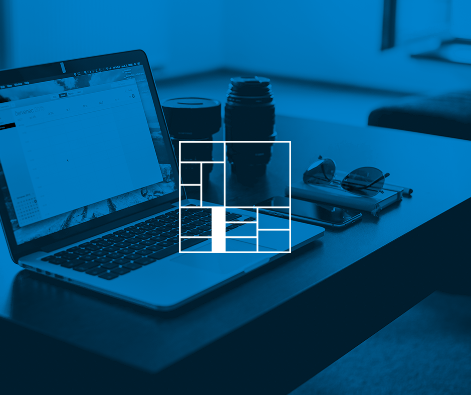
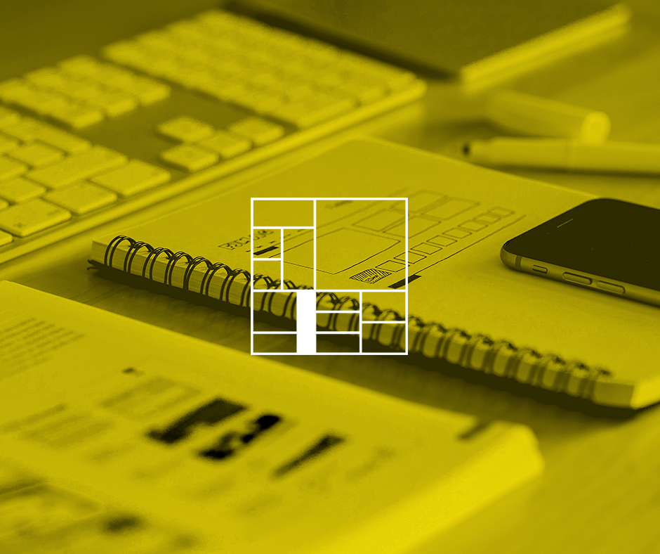
The whole identity for this project revolves around the logo. I think it's pretty obvious that I got my inspiration from Piet Mondrian's artwork entitled Composition II in Red, Blue, and Yellow.
The whole identity for this project revolves around the logo. I think it's pretty obvious that I got my inspiration from Piet Mondrian's artwork entitled Composition II in Red, Blue, and Yellow.
I decided to base the identity on that artwork because while I was thinking of a concept for this project, I tried to come up with an image that symbolizes both "order and creative chaos". I thought of lightbulbs, a brain, drawing materials, books - but those things were too mainstream. But then, I stumbled upon Mondrian's work and that gave me the idea of using his work for this project. In my opinion, this concept delivered "order and creative chaos" perfectly. I can even mess with the arrangement of the boxes as an added bonus. Thank God for square logos! Hoorah!
Another reason why I went with this concept is because I wanted to base the whole identity on minimalism and Swiss design.


COLOR PALETTE
For the color choice, I picked four colors from PANTONE's Solid Coated Color Book that matched the shades from te painting identically.

FONT & WORDMARK
For this project, I chose Keep Calm Medium and Panton as the identity's fonts. Keep Calm Medium is mainly for titles while Panton is for subtext. For the wordmark, used Keep Calm Medium but I modified the measurements of the letters in order to match the grid system. This means that one cannot just recreate the wordmark using regular text for the kerning values are exact.
For this project, I chose Keep Calm Medium and Panton as the identity's fonts. Keep Calm Medium is mainly for titles while Panton is for subtext. For the wordmark, used Keep Calm Medium but I modified the measurements of the letters in order to match the grid system. This means that one cannot just recreate the wordmark using regular text for the kerning values are exact.


VARIATIONS
I made sure that the logo itself can be rearranged so that it can adapt into any situation. I also made it that way so that it can live up to the phrase "order and creative chaos".


Thank you and please do appreciate my work if you can. I am also on Facebook so check my page if you have time. :)
https://www.facebook.com/charlesbulanofficialpage
https://www.facebook.com/charlesbulanofficialpage


